Why Custom Medical Packaging Has to Design for the Person Who's Already Scared
Posted by Oliver Inc. on 19th Aug 2026
There's a moment most manufacturers never think about. The patient is home. The pharmacy bag sits on the kitchen counter. They've just been prescribed something new, maybe for the first time, maybe after a diagnosis that shook them. They're not calm. They're not focused. They pick up the box, turn it over, squint at the label, and try to figure out what they're supposed to do next. This is the moment custom medical packaging has to be designed for, and most of it isn't.
The FDA receives over 100,000 reports of suspected medication errors every year. The Institute of Medicine puts the number of Americans with limited health literacy at 90 million. A study published out of Northwestern University found that nearly 1 in 3 Americans struggle with basic health tasks, including reading medication instructions correctly. Another study showed that nearly half of patients misread at least one of five prescription labels they were shown, and the errors weren't limited to people with low literacy. Patients with high school educations and above got things wrong too. Researchers identified the primary culprit as awkward wording and inconsistent formatting, not patient inattention. These aren't rare edge cases. They're the default state of pharmaceutical packaging right now.
What a Scared Patient Sees When They Open Your Box
Fear compresses cognitive capacity. Someone who just started a new cardiac medication, or a cancer treatment, or even a strong antibiotic they're nervous about isn't reading with their full attention. They're scanning. They need to know one thing immediately: am I doing this right? Custom medical packaging that addresses that question directly, before anything else, earns the patient's trust before they've taken a single dose.
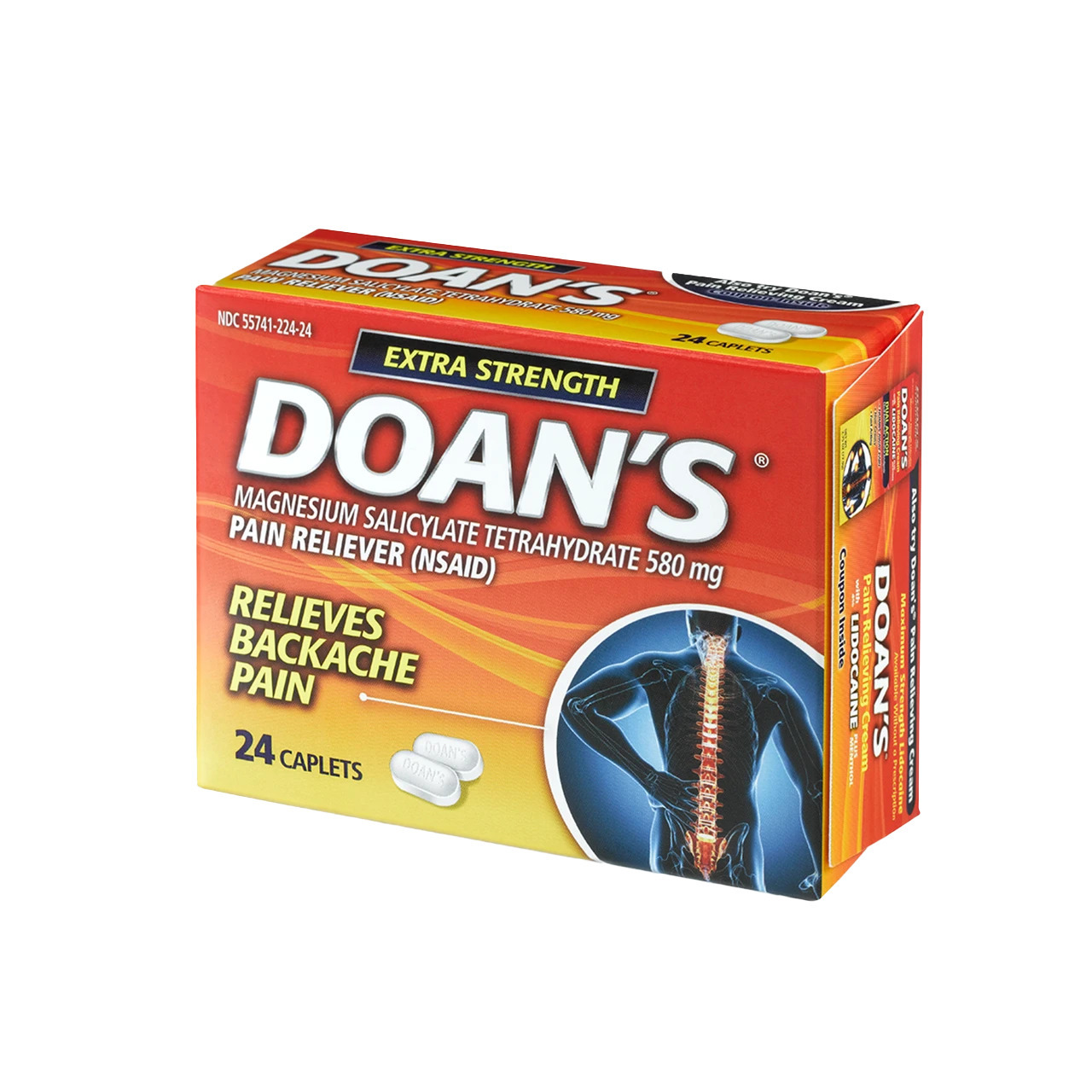
Manufacturers typically arrange information in order of regulatory priority instead of patient priority. The drug name takes up the most visual real estate. Warnings run in small type along the side panel. The layout buries dosage instructions in the middle of a wall of text, and the patient, who just wants to know how many to take and when, has to hunt for it. Research consistently shows that combining pictograms with text reduces dosing mistakes and improves recall. Most packaging still doesn't do this. The hierarchy of information reflects what manufacturers thought was important, not what the patient needs to find immediately.
Typography compounds the problem in ways that don't show up until a real person is holding the package under real conditions. Small fonts are the obvious issue, but the full picture is more complex. Contrast matters. A gray typeface on a white background reads fine on a monitor in a well-lit design studio and reads poorly under the bathroom vanity at 7am. Line spacing, font weight, the visual relationship between the label on the container and the printed carton — all of this determines whether someone can use the packaging when they actually need to. We design for the scenario where someone is calm and paying full attention. Patients use packaging under exactly the opposite conditions.
What Does "FDA Compliant" Actually Mean for the Person Reading Your Label?
The FDA has published formal guidance specifically on container label and carton labeling design to reduce medication errors. That guidance addresses look-alike packaging, measurement unit consistency, and the visual differentiation between products that come in multiple strengths. FDA compliant packaging is a floor, not a ceiling. Meeting those requirements means a manufacturer has cleared the minimum. It doesn't mean the packaging communicates clearly or that a first-time patient can figure out what to do in under 60 seconds.
Contract medical packaging partners who genuinely understand those requirements build pharmaceutical packaging solutions that go further. The core requirements of modern solutions for custom medical packaging don't stop at what regulators demand. They include sterile packaging integrity verified throughout the supply chain, material performance that holds up across humidity, light, and temperature variance, and print quality consistent enough that a patient reading a lot number or expiration date isn't squinting at a smear. Medical device packaging carries its own layer of this: regulations mandate sterility barrier performance, but the communication design surrounding that barrier often receives almost no attention from manufacturers.
Blister packaging medical applications are one area where the research is clearest. Studies on blister card formats show measurable improvements in medication adherence, and the WHO attributes up to 50% of treatment failures to poor adherence. The format of the package directly affects outcomes in a way no amount of clinical efficacy data can override. To maximize the utility and performance of blister cards, format, labeling, and peel resistance all have to work together. A card that's hard to open, or one where the printed information on each cavity is too small to read, undermines the entire adherence benefit before the medication even gets a chance.
Can Your Packaging Be Sustainable and Still Do Its Job?
Pharmaceutical and healthcare manufacturers have faced growing pressure toward sustainable medical packaging for years. The older calculation felt like a tradeoff: sustainable materials versus performance, or sustainability versus shelf presence. That's not where the industry is anymore. Responsibly sourced paperboard, reduced-plastic blister formats, and recyclable secondary packaging now perform at a level comparable to traditional materials when correctly specified and tested.
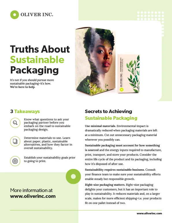
Right-sizing packaging so products don't ship in boxes twice their volume cuts freight emissions and warehousing costs. Designing structures that protect the product adequately without adding unnecessary material is better engineering, not a compromise. For medications with specific disposal requirements, that information needs to be prominent on the exterior, not folded inside an insert patients rarely open a second time.
The Box You Ship Is the Brand Patients Remember
Most manufacturers treat packaging as a cost center. The companies that get this right treat it as packaging as a brand-defining asset that communicates quality before the product is ever used. A patient who opens a box and immediately finds the dosage, reads it clearly, understands storage requirements, and feels like someone actually thought about their situation — that's packaging that builds trust before even trying the product. That trust transfers to the medication itself, and to the company that made it.
Packaging design for healthcare done well delivers precision, protection and brand impact without treating those as competing goals. A carton with clean information hierarchy, adequate contrast, thoughtful structure, and materials that reflect a real quality standard tells a patient something specific about what's inside before they've taken a single dose. Packaging that feels generic or hard to parse creates doubt, and doubt is a problem no clinical trial result can fix on its own.
Designing custom medical packaging for the conditions patients actually experience, the anxious first-time user, the low-light bathroom, the rushed caregiver managing multiple prescriptions, is where most manufacturers leave real value on the table. Your packaging can do better than that.