Insights: Articles & Resources by Oliver Inc.

The Psychology of Packaging Design
The Psychology of Packaging Design
Meta: Effective packaging design taps into basic human psychology, leveraging visual hierarchies, how people interpret and process complex stimuli, and emotional triggers to create a positive first impression that resonates with your target audience.
This article at a glance:
- First impressions matter more than ever. Effective packaging design captures attention and conveys key information within seconds, leveraging visual cues and psychological principles to create a positive first assessment.
- The psychology of color is invaluable for making packaging design choices. Colors subconsciously impact consumer behavior, with specific hues evoking different emotions and associations, making color selection crucial for brand identity and product appeal.
- Don’t overlook the other design elements. In addition to color, packaging structure, typography, and texture significantly influence consumer perceptions, amplifying consumer resonance.
First impressions determine whether a consumer will engage with your product or pass it by. Within seconds, a package must capture attention, convey key information, and evoke positive emotions. Your products rarely get more attention than that.
Much hinges on deliberate packaging design.
The psychology behind this rapid assessment stems from our brain's tendency to make quick judgments based on visual cues.
Effective packaging design taps into basic human psychology, leveraging visual hierarchies, gestalt principles (how people interpret and process complex stimuli), and emotional triggers to create a positive first impression that resonates with your target audience.
Getting it right will result in repeat purchases from loyal consumers.
The Role of Color in Capturing Consumer Attention
Colors impact consumers on a subconscious level. They match a person’s current needs with particular products or help them filter out items in noisy retail aisles that may not align with their personal goals.
Color is often the first element that registers in a consumer's mind, making an immediate impact and influencing their overall perception of your product. Naturally, different colors evoke specific emotions and associations, as do different hues.
Keep in mind that the associations with any given color vary depending on culture, regional demographics, and even age group.
Red, for instance, is traditionally a bridal color symbolizing purity in India. In Russia, red may conjure memories of the Bolsheviks or communist regimes, while it has a strong association with Christmas in many Western cultures. So, you’d better know the cultural and political histories of the markets that fall within your brand’s reach (or those you’re expanding to).
What Colors Mean in Packaging Design
- Red is a dominant color associated with excitement, passion, and urgency. It evokes strong emotions such as love, anger, strength, and power, while also stimulating brain wave activity and increasing heart rate and blood pressure (in good ways, when employed properly). Since viewing the color red can trigger appetite, it’s a popular color for food and beverage packaging design.
- Blue communicates trust and reliability to consumers. It’s calming in nature. It signals dependability or stability, which are important messages for consumers to encounter when shopping for tech products and health-related items (high-stakes industries).
- Green is ubiquitous in the natural world, conjuring up images of nature, health, and sustainability. You’ll notice it’s frequently seen on organic or eco-friendly products. Pairing it with earthy beiges or browns amplifies its appeal to environmentally conscious consumers looking for ecologically ethical products.
- Yellow broadcasts optimism and warmth. It’s an overall positive vibe that catches the eye quickly and is often used for impulse purchases.
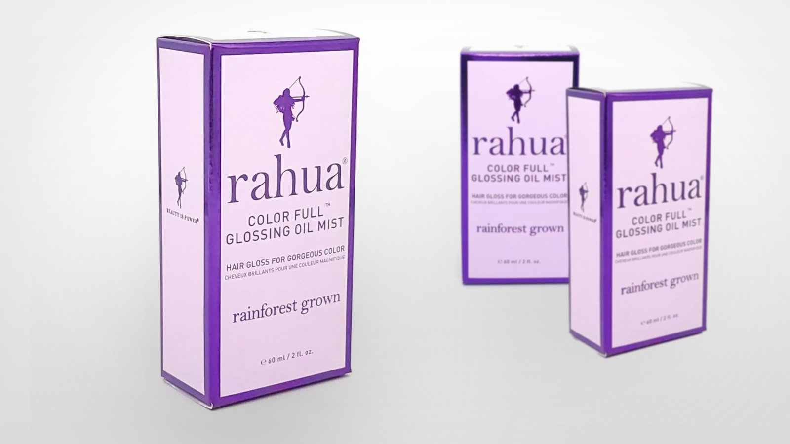
- Purple retains strong ties to luxury and royalty. Its regal quality makes it common in beauty and premium product packaging.
- Orange, on the other hand, brings to mind affordability, though not always. It’s energetic, enthusiastic, and often used for budget-friendly or youth-oriented products.
- Black personifies sophistication and power. It’s elegant and chic, making black popular for luxury or high-end products.
- White evokes purity and cleanliness. It’s used in packaging designs to signal simplicity and minimalism. It carries a certain neutrality that’s appealing in the authority-laden healthcare field.
Creating Info Hierarchies Using Color
Color psychology in packaging goes beyond individual hues. Contrast and color combinations can create a visual hierarchy, guiding consumers’ eyes to key information.
- High-contrast color pairings, such as black and white or complementary colors, immediately draw attention and can be used to highlight the most important elements, such as your brand name or product type.
- Printing and packaging designers often use a dominant color for the main packaging body, with a contrasting accent color to make certain information pop. This technique can direct the consumer’s eye to critical details such as nutritional facts, usage instructions, or unique selling points.
- Gradients or color transitions can create a sense of depth and movement, subtly leading the viewer's gaze across the package.
- Warm colors such as red or orange tend to advance visually, while cool colors, including blue or green, recede. This principle can be exploited to bring key information forward while pushing less critical details to the background.
- Using an unexpected or bold color can make an element stand out against a more muted background, instantly captivating attention.
- Vibrant or saturated colors naturally draw the eye first, while softer, more muted tones can be used for secondary information. This creates a natural flow of visual importance.
Be Color Consistent, True to Your Brand
It goes without saying, but your brand should prioritize color consistency across product lines to build recognition and loyalty.
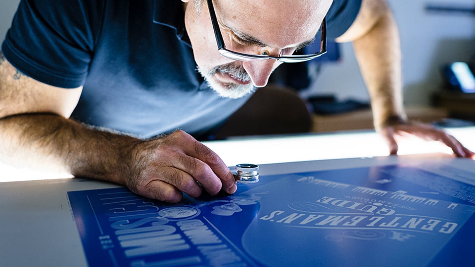
Even the slightest variance in hue may lead consumers to think your product is not on the shelf while they frantically scan dozens of products for the exact color etched upon their memories. Extended gamut printing, in tandem with Pantone-certified printing, ensures near-exact color replication.
Packaging Design Elements Informed by Psychology
In addition to color, you want to carefully consider the structure, typography, and texture used in your packaging.
Packaging Structure
Shape and form have similarly subtle impacts on consumer perceptions. Rounded shapes are generally perceived as more approachable and comforting, while angular designs may suggest efficiency or modernity. The "golden ratio" is often employed to create aesthetically pleasing proportions that are subconsciously appealing to the human eye.
Unconventional or distinctive shapes can attract attention on overloaded shelves. Unique forms make the product stand out, prompting curiosity and a desire to explore the product further.
Symmetrical shapes are often perceived as balanced and aesthetically pleasing, while asymmetrical designs can evoke a sense of creativity and modernity.
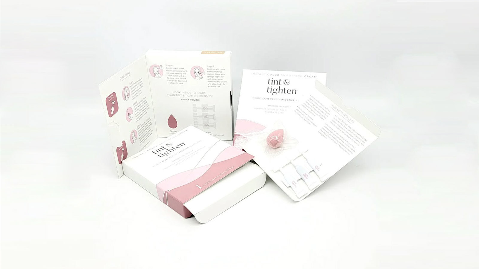
The packaging construction itself can trigger psychological responses, as well. Easy-to-open designs can reduce frustration and increase satisfaction, while clever or unique opening mechanisms can create a sense of novelty and engagement. If implemented poorly, however, complicated mechanisms can irritate consumers, while simplistic or generic structures may reflect poorly on your product’s value.
Juice giant Tropicana’s redesign to a supposedly “easy-to-open container” comes to mind. Its plastic top opening turned out to be everything but simple, irking well-established customers, thus plummeting product sales.
Typography
The style, size, and placement of fonts can quickly convey your brand's personality. For example, sleek, modern fonts suggest a premium product, while playful, hand-drawn fonts can give a product a more casual, fun vibe.
As with different colors, font styles play a role in shaping emotional responses. Serif fonts can give a sense of tradition and reliability, while sans-serif fonts often feel more contemporary and clean. This is not always the case, though. As you may have noticed, for instance, the recent rise in vintage fonts among millennial consumers keen on all things artisanal or handcrafted is a reaction to the hollowness and poor quality attributed to mass-produced products.
Font style also depends on your industry.
In highly regulated sectors such as pharmaceuticals, cannabis, and personal health products, legibility is vital for relaying important information, warnings, and instructions to consumers. In general, if your font is difficult to read, consumers may overlook critical details or become frustrated, leading them to choose your competitor’s product.
Texture
Texture, both visual and tactile, can influence perceived quality and create a memorable sensory experience. For instance, matte finishes might suggest naturalness, while glossy surfaces and embossed patterns can imply sleekness or luxury.
Selectively applying specialty laminates and spot UV printing enhances the presumed value of your products, as well. These added decorative effects signal premium quality.
The Future of Packaging Design
Predicting packaging design trends is a tricky business, certainly, but a seasoned custom packaging supplier worth its weight in folds will be attuned to the real-time preferences of consumers.
Several stand out at the moment.
Go green. Sustainability only becomes a more ubiquitous concern as climate change and ecological catastrophes worsen. More and more consumers gravitate toward eco-friendly solutions that minimize waste, source paperboard from responsibly managed forests (as certified by FSC and SFI), and manufacturing processes that reduce a brand’s carbon footprint.
Make the necessary systemic changes to processes for your company to earn sustainability certifications that can adorn your packaging. Those icons speak immediately to consumers’ ethical senses. Adopting right-size packaging is another great place to start with sustainable design.
Integrate connected elements into your packaging design. Digital integration will blur the lines between physical and virtual experiences, offering new ways to engage customers. Adding QR codes, URLs, hashtags, and barcodes encourages consumers to continue their physical interactions with you in the digital realm.
Their presence on your packaging instantly signals to consumers that you’re relevant, sophisticated, and in line with the times—leading edge, even.
Give consumers a reason to trust you. An increasing number of consumers want brands to lead with their social values. Integrate tight visual storytelling into your packaging that reflects your company’s commitment to values shared with your target consumers.
If they feel an instant affinity with your ethos, they’re going to become devoted to your brand.


